
Beyond the AI Template Look: A Field Guide to Distinctive Web & UI Design
I spend most of my days building with AI — agentic workflows, SaaS products, the whole stack. So I notice the tell. Open Product Hunt on any given morning and the launches blur together: a pure-black background, a purple-to-blue gradient blob, a centered headline that says something like "Reimagine the future," two pill buttons, a sheet of glassmorphism over the top. It's competent. It's also indistinguishable from the thirty products that shipped the same week.
That sameness isn't a coincidence. It's what you get when a model fills in the blanks with the most statistically average choice at every step. The good news for anyone who builds: distinctiveness is cheap if you're deliberate about it. It doesn't take a famous art director. It takes a real type system, a perceptually-uniform color palette built on near-neutrals, generous whitespace, purposeful motion — and the restraint to make one or two strong choices instead of fifty weak ones.
This is the field guide I actually use when I'm building a frontend in Laravel, Blade, Vue, and Tailwind. It's opinionated, it's concrete, and every value in it is ready to drop into a project today.
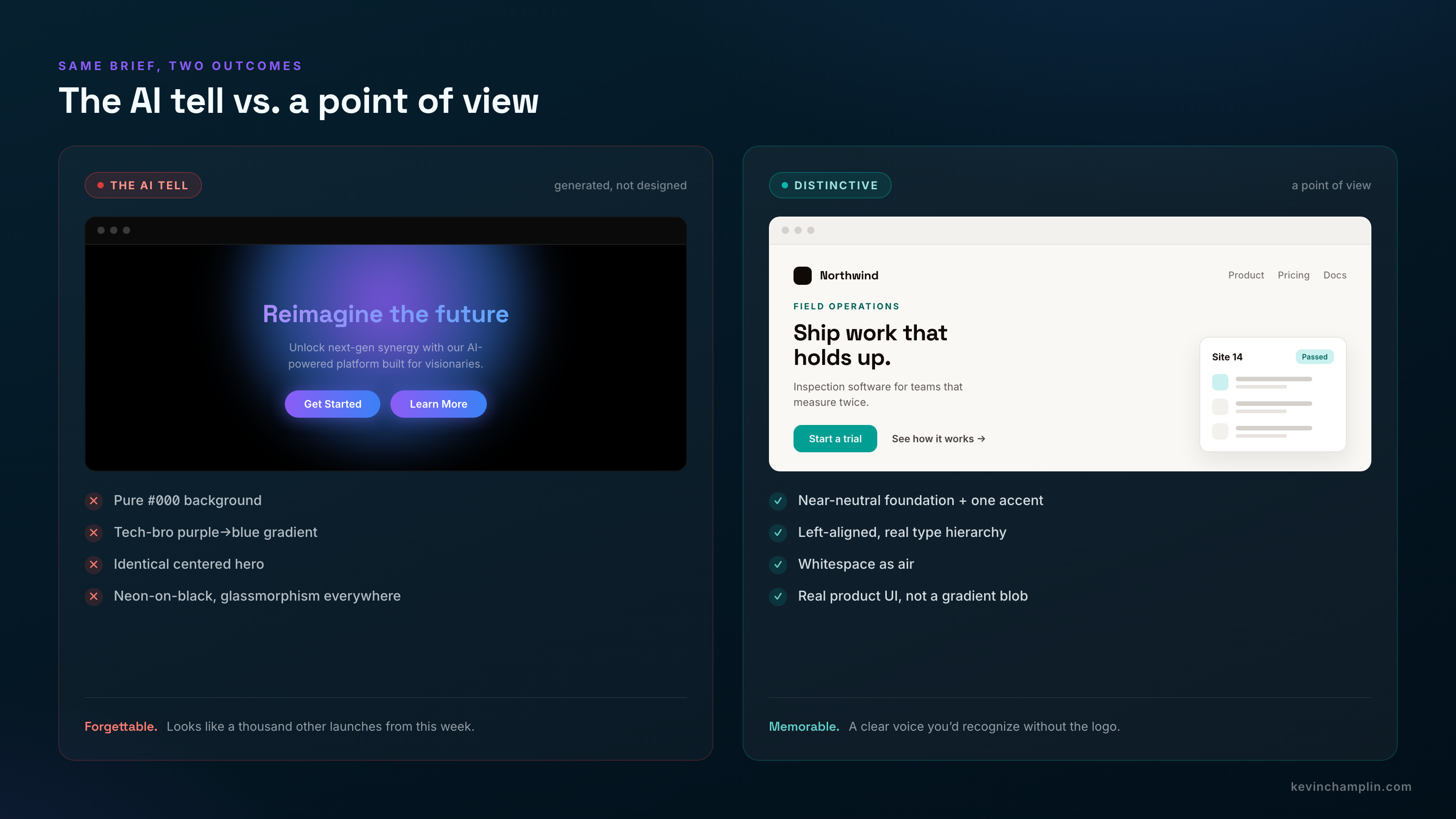
Distinctiveness comes from restraint plus one or two strong, intentional choices — not from piling on neon, gradients, and glass until something feels "designed."
Color: build it in OKLCH, not HEX
The single biggest practical upgrade you can make to your color workflow is to stop thinking in HEX and HSL and start thinking in OKLCH. Tailwind v4 ships its entire palette in OKLCH for a reason: it's perceptually uniform. Pick a lightness value and every hue at that lightness looks equally bright — which makes generating a consistent 50→950 ramp reliable instead of a guessing game. Your blue stays blue from light to dark instead of drifting purple the way naive lighten()/darken() math does, gradients don't go muddy in the middle, and you get wide-gamut P3 vividness for free.
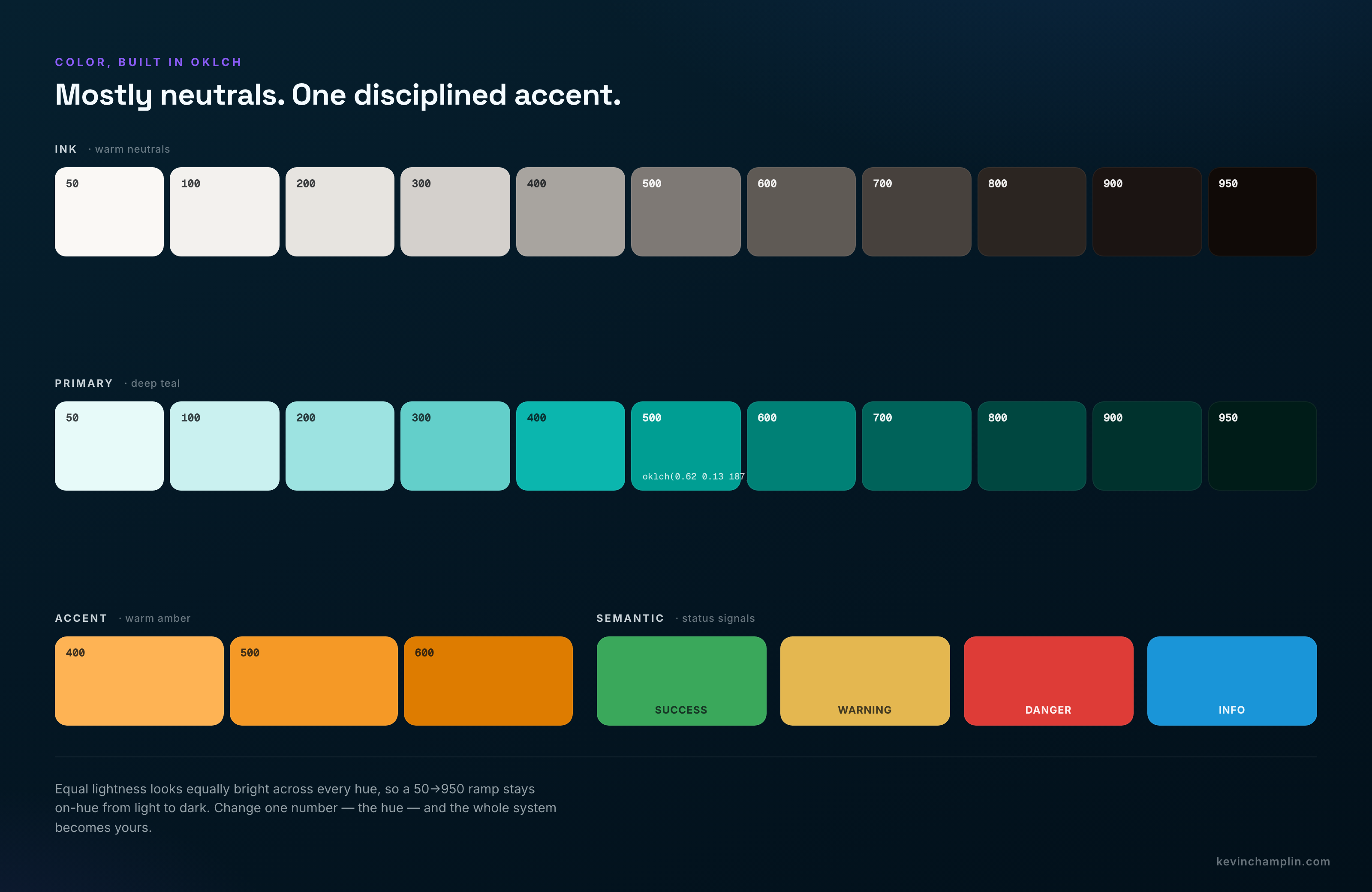
But the bigger secret is that great interfaces are mostly neutrals. You don't build a UI from five perfect swatches. You build it from 8–10 grays, one or two brand colors with ~10 shades each, and a small set of semantic colors. Two rules from Refactoring UI that I never break:
- Never use pure black (#000) or pure white (#fff) for large areas. Pure black on white is 21:1 — harsh, it causes haloing, and it reads cheap. Use a near-black and an off-white.
- Tint your grays. Pure grayscale doesn't exist in nature. Shift your neutrals slightly toward your brand hue — warm (toward red/yellow) for human and editorial, cool (toward blue) for technical and corporate. Temperature is a brand decision, and it's one of the easiest ways to stop looking like a template.
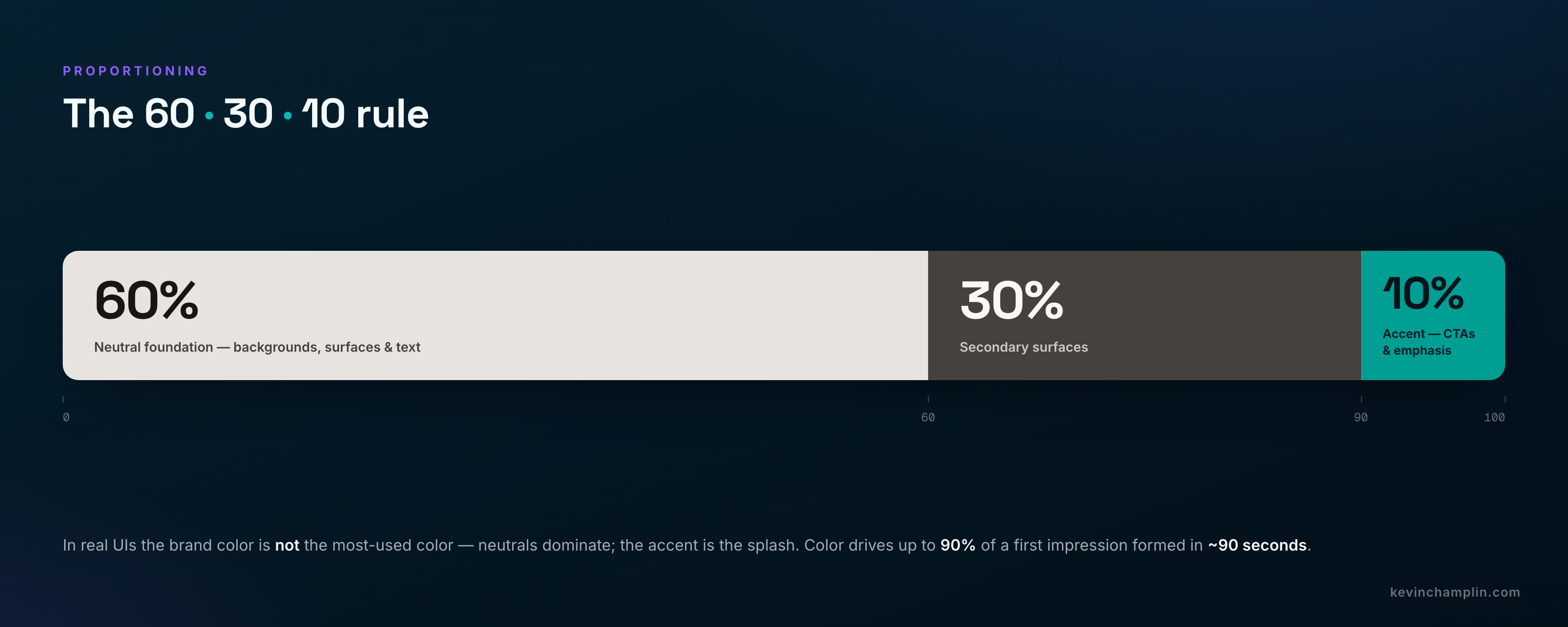
And once you have a palette, proportion it. The 60-30-10 rule keeps things balanced: roughly 60% dominant (almost always a neutral background), 30% secondary, 10% accent. The counterintuitive part is that your brand color is not the most-used color on the page. Think Netflix or Target — mostly neutral, with a signature splash. Color matters more than we like to admit: the Institute for Color Research found people form a subconscious judgment about a product within 90 seconds, and up to 90% of that assessment is based on color alone.
Contrast is non-negotiable (and increasingly a legal floor)
Contrast is the most common accessibility failure on the web, and it's getting worse. The WebAIM Million report (February 2026) found low-contrast text on 83.9% of the top million home pages — up from 79.1% a year earlier — at an average of 34 instances per page. It's also no longer just good manners: the EU's European Accessibility Act came into force on 28 June 2025, with national penalties reaching up to €100,000 per violation or 4% of annual revenue. Here are the thresholds I treat as the floor, not the ceiling:
| Element | AA (minimum) | AAA |
|---|---|---|
| Normal body text | 4.5:1 | 7:1 |
| Large text (≥24px, or ≥18.66px bold) | 3:1 | 4.5:1 |
| UI components, borders, icons, focus rings | 3:1 | — |
Two more rules: never rely on color alone to convey meaning — pair it with an icon, label, or pattern, because color-vision deficiency affects 1 in 12 men. And aim higher than 4.5:1 for body text where you can; a bare pass is still hard for plenty of users. Wire axe-core, Pa11y, or Lighthouse into CI so a regression fails the build instead of shipping.
Typography is your highest-leverage decision
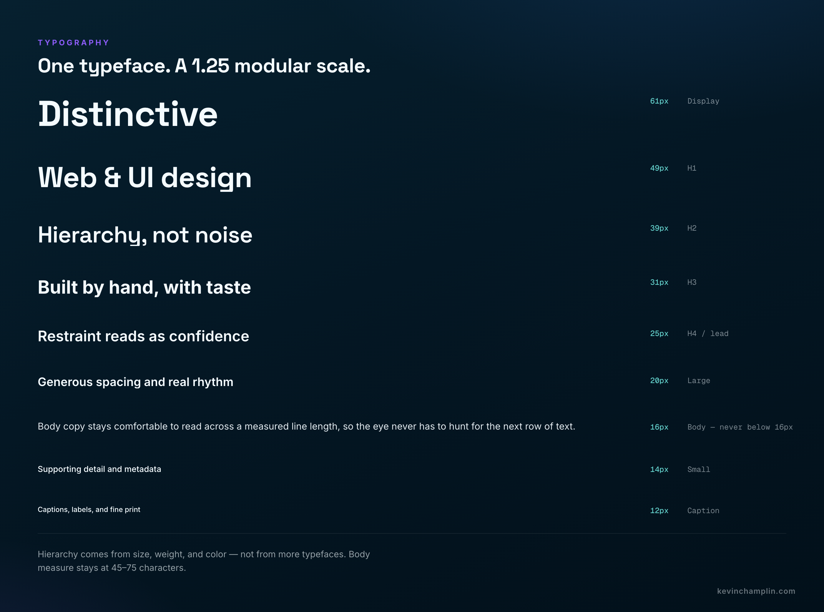
One excellent typeface, used with a clear modular scale, the right measure, and proper line-height, beats any amount of decoration. The mechanics that matter most:
- Measure (line length): 45–75 characters, with ~66 as the classic sweet spot. In CSS that's just
max-width: 66ch;. - Line height: ~1.5–1.6 for body, tighter (1.1–1.3) for big headings.
- Body size: never below 16px, set in
remso user zoom is respected. - Hierarchy comes from size, weight, and color — not from a second or third typeface.
Pick a base size (16px) and a ratio, then build a scale by multiplying. A 1.2–1.25 ratio is the workhorse for product UI; 1.333 (Perfect Fourth) gives marketing sites stronger hierarchy.
| Ratio | Name | Best for |
|---|---|---|
| 1.125 | Major Second | Dense dashboards, data-heavy apps |
| 1.200 | Minor Third | Balanced product UI (very common) |
| 1.250 | Major Third | Clear, marketing-friendly |
| 1.333 | Perfect Fourth | Strong hierarchy, marketing sites |
For the typeface itself: Inter is the de facto modern SaaS default — Linear, Notion, Figma, and GitHub all use it — and it's free, variable, and built for screens. If you want one family, use Inter with weight contrast and call it done. If you want a little more character, pair a distinctive display face with a neutral body: Fraunces or Bricolage Grotesque over Inter; Space Grotesk with Space Mono for a dev-tool feel; or Vercel's open-source Geist. The one rule: two families max (a third only as a sparing mono accent), and never pair two similar geometric sans — that's hierarchy confusion, not contrast. Always self-host or preconnect, subset to the glyphs you use, and set font-display: swap.
Space like you mean it
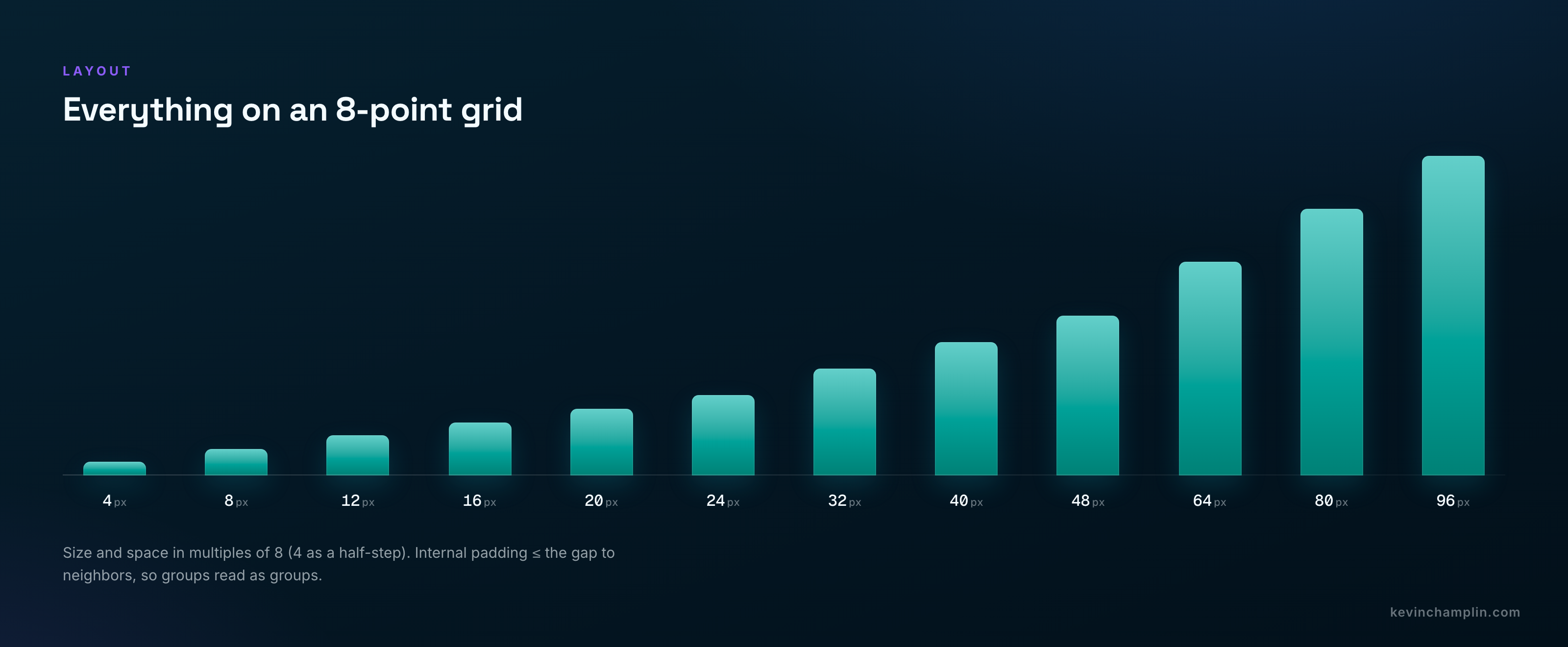
Size and space everything in multiples of 8 — 8 / 16 / 24 / 32 / 48 / 64 / 96 — with 4px as a permitted half-step for tight gaps. It divides cleanly across pixel densities, most screen dimensions are divisible by 8, and both Apple and Google recommend it. Pair an 8pt grid for layout with a 4pt baseline grid for text rhythm (set your line-heights to multiples of 4).
The cheapest luxury in any interface is whitespace. The rule of thumb I borrow from Stripe, Linear, and Vercel: take the spacing that feels like enough — then double it. Negative space is what creates focus, perceived quality, and scannability. For the structural layout itself, use Flexbox for one-dimensional component internals, CSS Grid for two-dimensional page sections, and reach for container queries (first-class in Tailwind v4) over media queries for any reusable component, so a card styles itself by its container's width rather than the viewport's.
Dark mode, done right
Dark mode is where amateur work gives itself away fastest. Three things separate the good from the generic:
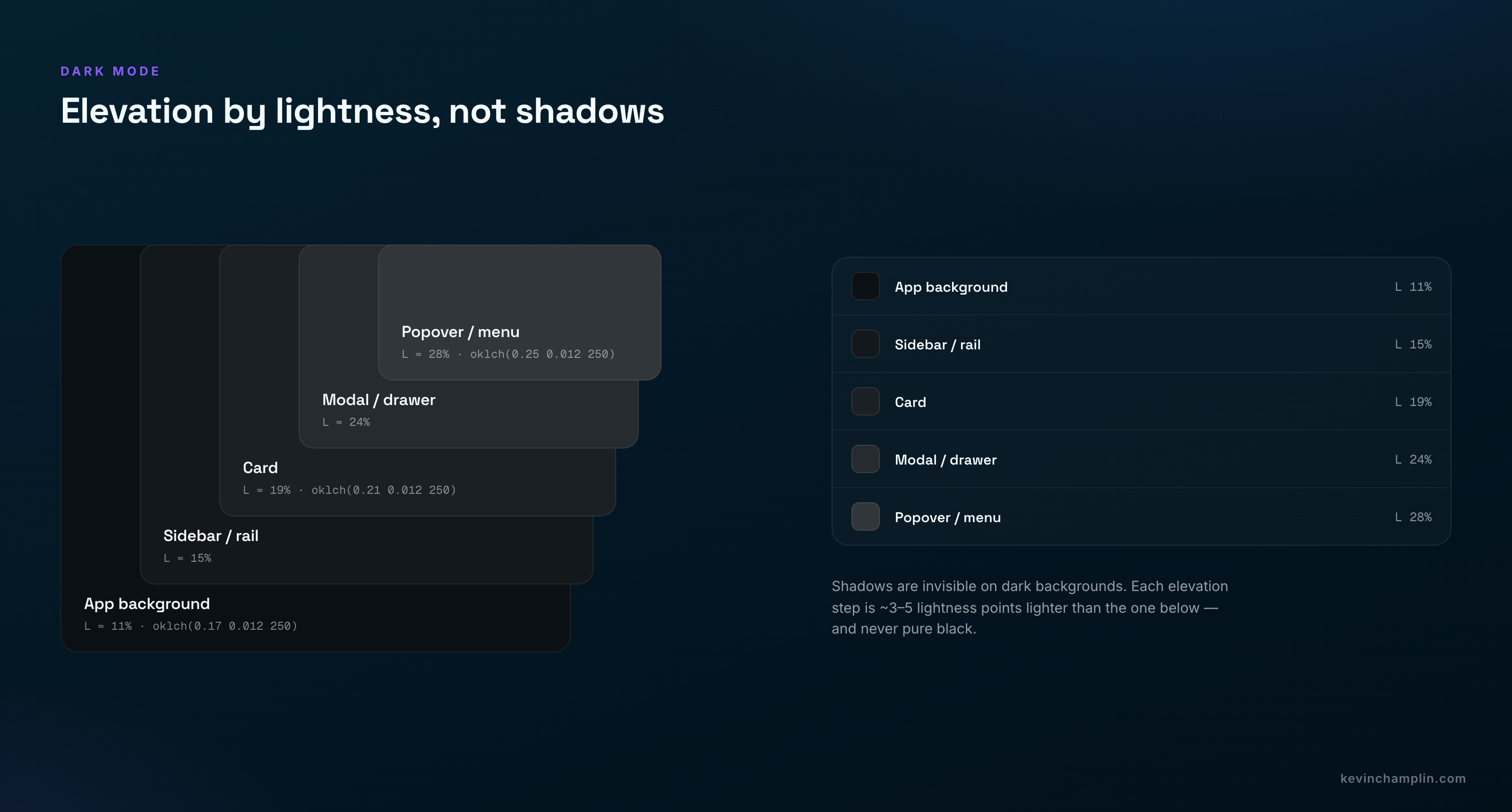
- Never pure black. Use a dark near-black around 8–12% lightness — a deep navy or warm charcoal. Pure black causes haloing around text and gives you nowhere to go for elevation.
- Express elevation with lightness, not shadows. Shadows are invisible on a dark background. Each step up — base, sidebar, card, modal, popover — gets ~3–5 lightness points brighter.
- Desaturate and lighten your accents. A vivid blue that's perfect on white turns aggressive on dark. Soften your text too: use an off-white, not #fff.
The theme I start every project from
Here's the payoff. This is a Tailwind v4 @theme block I keep as a starting point — deliberately not the generic look: warm off-white/near-black neutrals, a confident teal primary instead of the default indigo, and a sparing warm amber accent, all in OKLCH. Tailwind v4 turns these tokens into both CSS variables and utility classes at once.
@import "tailwindcss";

@theme {
  /* NEUTRALS — warm-tinted, never pure #000/#fff */
  --color-ink-50:  oklch(0.98 0.004 80);   /* off-white bg */
  --color-ink-500: oklch(0.58 0.009 65);
  --color-ink-950: oklch(0.15 0.012 45);   /* near-black text */

  /* PRIMARY — deep teal (distinctive, not indigo) */
  --color-primary-500: oklch(0.62 0.13 187);  /* button bg */
  --color-primary-600: oklch(0.53 0.12 186);

  /* ACCENT — warm amber, used sparingly */
  --color-accent-500: oklch(0.76 0.16 65);

  /* SEMANTIC */
  --color-success-500: oklch(0.65 0.15 150);
  --color-danger-500:  oklch(0.60 0.20 27);

  /* TYPE */
  --font-sans:    "Inter", ui-sans-serif, system-ui, sans-serif;
  --font-display: "Fraunces", Georgia, serif;

  /* SPACING (4px base, 8pt rhythm) */
  --spacing: 0.25rem;

  /* RADII + MOTION */
  --radius-lg: 0.75rem;
  --ease-standard: cubic-bezier(0.2, 0, 0, 1);
}
Now the trick that makes it yours: that primary hue is the number 187 (teal). Swap it — 25 for terracotta, 300 for magenta, 145 for emerald — and because it's OKLCH, the entire 50→950 ramp stays perfectly balanced. You change one number and the whole brand shifts, on-hue, no muddy shades. That's the workflow upgrade in a single line.
What the design-led leaders actually do
Study Linear, Stripe, Vercel, Notion, and Mercury and the same formula keeps surfacing: high contrast, abundant whitespace, a monochrome / near-neutral foundation plus one disciplined accent, and sharp, intentional typography — executed so consistently it feels inevitable. Stripe's "blurple" (#635BFF), Linear's desaturated indigo (#5E6AD2), Raycast's red (#FF6363). Several of them commissioned custom type — Vercel's Geist, Stripe's Söhne, Mercury's Arcadia — because custom or carefully-chosen type is a brand moat. Across every screen, "the same person made this."
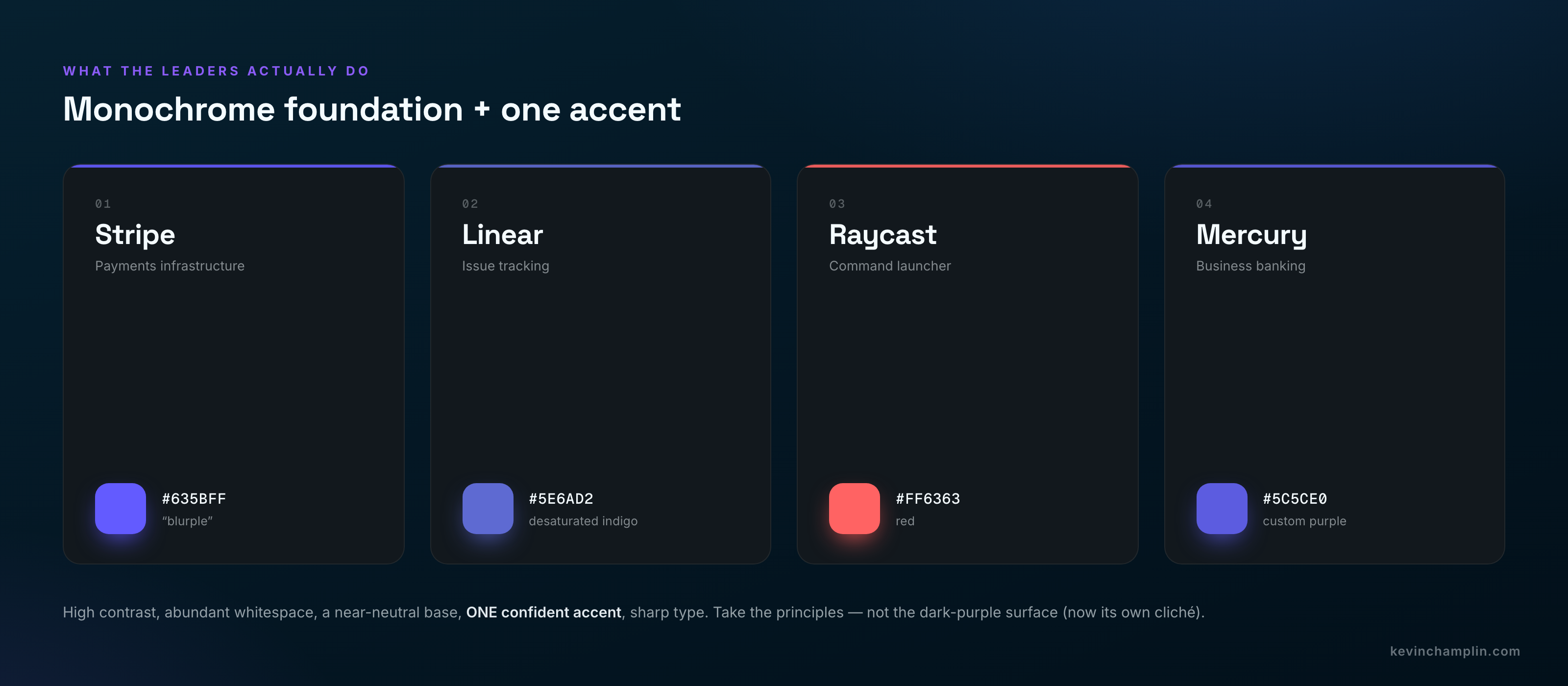
One honest caution: the dark-mode-plus-one-neon-accent look is now itself becoming a cliché — the new "blue for trust." So take the principles — contrast, whitespace, restraint, custom-feeling type, real product imagery — and apply your own palette and temperature. Don't copy the dark-purple surface.
How to make it yours: the anti-cliché checklist
- Start in grayscale. Real copy and hierarchy first; don't pick colors and fonts until the structure works.
- Pick a non-default accent hue and an unexpected neutral temperature. Skip #000 black and the purple→blue gradient on principle.
- Invest in one distinctive type choice — a characterful display face, or a quality variable workhorse used with real weight contrast.
- Art-direct your imagery. Real product UI beats abstract illustration for SaaS every time. If you use photos, give them one consistent grade.
- Systematize with tokens (primitive → semantic → component), then add one or two signature touches — a motion signature, a distinctive shape, a custom illustration accent.
- Audit before you ship: WCAG 2.2 AA contrast, full keyboard operability, visible focus states, and good Core Web Vitals (LCP < 2.5s, CLS < 0.1, INP < 200ms). The design-led leaders score 90+ on Lighthouse accessibility — treat it as a quality signal, not a checkbox.
None of this is exotic. It's a type scale, an 8-point grid, an OKLCH palette built on neutrals, and the discipline to make a couple of strong choices and stop. Use AI for speed and iteration — I do, all day — but reserve human judgment for the final 20% that creates character. That last slice is the entire difference between a product that looks like everyone else's and one that looks like yours.
If you're building something that needs to look like a senior team shipped it — not a template — that's exactly the kind of work I take on.
Work with meLinks mentioned