
Web Design & Mobile Apps: From One Browser to the iPhone Duo

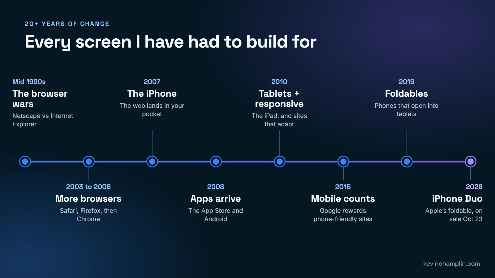
I have been building websites and apps for more than 20 years. In that time the screen people use to find a business has changed shape at least eight times. This month it changes again: Apple's first folding phone, the iPhone Duo, goes on sale on October 23, 2026, and I am updating mobile apps so they look right on it.
Plenty of business owners are hearing about the Duo and wondering whether they need to do something. Here is the honest answer from someone who has lived through every one of these shifts: it is one more iteration in a long line of them. Each one looked like a big deal at the time. Each one was manageable for anyone who planned for it. Here is the whole story, in plain English, and what it means for your website and your app.
Key takeaways
- The web has gone from one main browser, to several competing browsers, to phones, apps, tablets and now folding phones. Every step forced websites and apps to change.
- Responsive design (a site that rearranges itself to fit any screen) is the idea that made all of this manageable, and it still is.
- Google now judges your website mostly by how it works on a phone, so mobile is not optional.
- The iPhone Duo goes on sale October 23, 2026. Apps that have not been updated will show black borders on its big inside screen.
- Apple will require iPhone Duo screenshots for App Store submissions from April 2027, so every app owner has a deadline.
- The businesses that handle each change easily are the ones whose website and app were built to adapt from the start.
What was building a website like when nearly everyone used one browser?
Short answer: Simpler. In the early 2000s most people browsed with Internet Explorer on a desktop computer, so if a site looked right there, it looked right for almost everyone.
The browser wars of the mid 1990s, Netscape against Internet Explorer, ended with Internet Explorer on nearly every computer. For a few years that made the job predictable. You designed for one browser, on one kind of screen (a desktop monitor), and you were done.
It did not last, and the habits it created caused trouble later. A lot of websites were built to work in that one browser and nowhere else. When people started using something different, those sites broke.
Why did more browsers make building websites so painful?
Short answer: Each browser read the same website a little differently, so a page that looked perfect in one could be broken in another. Every site had to be checked and fixed in each one.
Safari arrived in 2003, Firefox in 2004 and Chrome in 2008. Each was built on its own engine, the part of the browser that turns a website into what you see on screen. Those engines did not agree with each other. A menu that lined up perfectly in Internet Explorer might overlap the logo in Safari. A form that worked in Firefox might refuse to submit in Internet Explorer.
Honestly, it was a pain. A big part of my week went to building a page once and then fixing it three or four more times, one browser at a time. What it taught me has stuck: never assume a site works because it works on your own computer. Check it where your customers actually are. Internet Explorer was finally retired in June 2022, and I do not miss it.
What changed when the iPhone arrived in 2007?
Short answer: The web moved into people's pockets. Websites built for big desktop screens suddenly had to work on a small screen, with a finger instead of a mouse.
The first iPhone went on sale on June 29, 2007. It showed full websites, which was amazing, but those websites were shrunk down to fit a tiny screen. Customers had to pinch and zoom to read anything, and buttons were too small to tap.
A whole new set of questions landed on every website owner. Can someone read this without zooming? Can they tap the phone number and call? Does the menu work without a mouse? Many businesses answered by building a second, separate "mobile site". That worked for a while, but it meant keeping two websites up to date, and the mobile version was usually missing half of the content.
How did mobile apps change the job?
Short answer: Apps gave businesses a place on the customer's home screen, but they came with two app stores, two sets of rules, and a review process before anything goes live.
Apple opened the App Store in July 2008, and the first Android phone came out that fall. Suddenly "do we need an app?" was a question every business asked. Building an app is different from building a website. It has to be approved by Apple or Google before customers can download it. It has to follow each company's design rules. And it has to be updated whenever they release new phones or new versions of their software.
That last point is exactly why the iPhone Duo matters to app owners. The app does not update itself to fit a new kind of phone. Someone has to do it.
What is responsive design, in plain English?
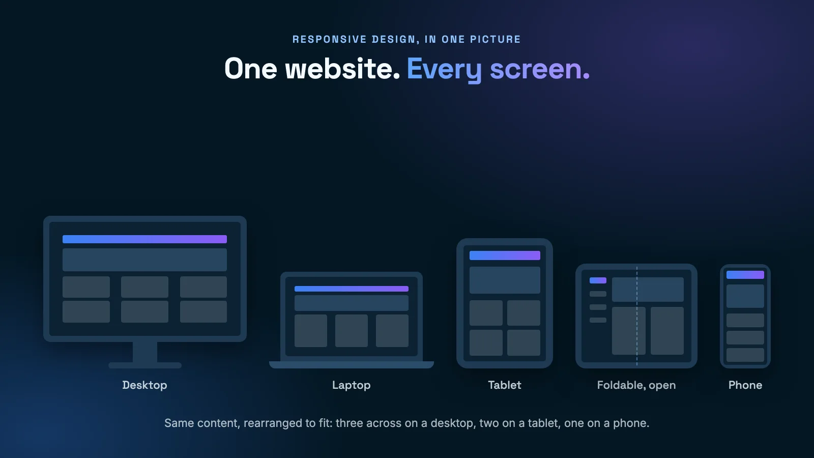
Short answer: One website that rearranges itself to fit whatever screen it is on, like water taking the shape of the glass. Three columns on a desktop, two on a tablet, one on a phone.
The term "responsive web design" was coined in 2010, and it fixed the two-websites problem. Instead of building a desktop site and a separate mobile site, you build one site with one set of content that adapts. The text, photos and buttons rearrange depending on how much room there is.
This is still the most important idea in web design. It is also the reason a well-built website handles a new device like the iPhone Duo without a rebuild. If the site was designed to adapt, a new screen size is just one more size.
Why did tablets matter for websites and apps?
Short answer: Tablets added a size in the middle, bigger than a phone and smaller than a laptop, that could be held either way up. Designs that only planned for "phone" and "desktop" looked awkward on them.
The iPad came out on April 3, 2010, the same year responsive design got its name. Tablets proved that screen sizes would keep multiplying. A tablet turned sideways is almost a laptop. Held upright, it is closer to a big phone. A good website or app has to look intentional both ways, not stretched or squeezed.
That lesson matters again now, because an open folding phone is roughly a small tablet.
Why does Google care whether my website works on a phone?
Short answer: Because most searches happen on phones. Google started rewarding phone-friendly sites in 2015 and now judges websites mainly by how they work on a phone.
On April 21, 2015, Google started favoring websites that work well on phones in its mobile search results. Since then it has gone further: Google now mainly looks at the phone version of your website when it decides how to rank you. If your site is hard to use on a phone, it is harder to find, full stop.
This is where web design and search engine optimization (SEO) became the same job. A site that is fast, readable and easy to tap on a phone ranks better and turns more visitors into customers. The same is true for AI assistants like ChatGPT and Google's AI answers, which favor clear, well-organized pages they can quote.
What is the iPhone Duo, and why does it matter to business owners?
Short answer: The iPhone Duo is Apple's first folding phone. It goes on sale October 23, 2026, and opens into a 7.6-inch screen. Apps that are not updated for it will show black borders on that big screen.
Folding phones are not brand new. The first mainstream one arrived in 2019. But Apple entering the market changes things, because iPhone owners are a huge share of the customers most businesses care about. Preorders opened on October 12 at $1,999.
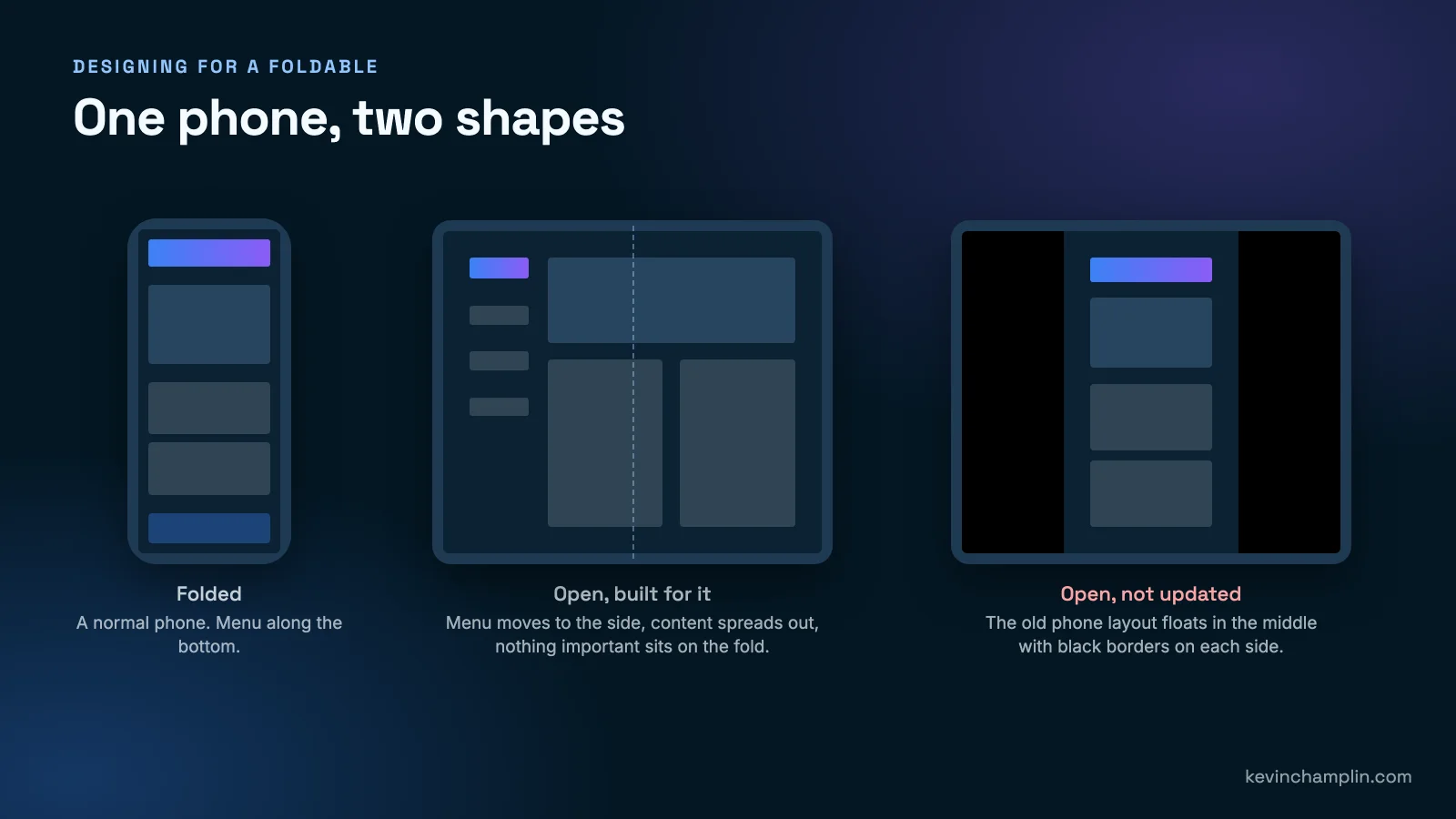
Closed, the Duo works like a normal iPhone. Open, it is close to a small tablet. Your app has to look right in both shapes, and switch smoothly when someone opens or closes the phone partway through using it. Apps that are not updated for the Duo show up with black borders on the inside screen, which looks dated next to apps that fill it. And from April 2027, Apple will require iPhone Duo screenshots when you submit an app to the App Store, so every app owner will have to deal with it sooner or later.
How am I updating apps for the iPhone Duo?
Short answer: By applying the same idea that made websites work on phones and tablets: make each screen rearrange itself to fit, then test it in both shapes on the real thing.
Right now I am updating the mobile apps we build and run at Champlin Enterprises so they are ready when the Duo lands in customers' hands. In plain terms, the work comes down to a handful of things:
- Fill the whole screen. No black borders when the phone is open.
- Rearrange, do not stretch. When the phone opens, content spreads into a layout made for the bigger screen instead of a phone layout blown up.
- Move the menu to the side when there is room, the way a tablet app does, and back to the bottom when the phone closes.
- Keep important things off the fold. Buttons and text should not sit in the crease down the middle.
- Do not lose your place. If someone opens the phone halfway through filling in a form, everything they typed should still be there.
- Get new App Store screenshots made well before the April 2027 deadline.
Where an app shares one codebase between iPhone and Android, each fix is made once and works on both. That is the same lesson as responsive design, applied to apps: build things to adapt, and every new device costs less to support.
Is your website or app ready for the iPhone Duo?
Short answer: A responsive website is probably fine already. An app almost certainly needs an update. Run through the six checks below.
For a website, open it on a phone and on a tablet, turn each one sideways, and look for anything squeezed, stretched or cut off. If it rearranges itself nicely, it will handle an open Duo too. If you still have a separate mobile site, or your site only looks right on a desktop, that is the real problem, and it is costing you in Google already.
For an app, here is the checklist I use:
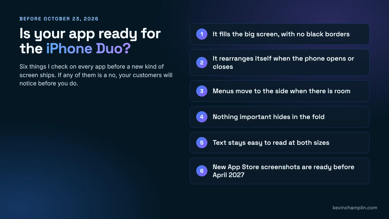
- Does it fill the big screen, with no black borders?
- Does it rearrange itself when the phone opens or closes?
- Do menus move to the side when there is room?
- Is everything important kept out of the fold?
- Is the text easy to read at both sizes?
- Are new App Store screenshots ready before April 2027?
What has stayed the same through every change?
Short answer: Customers want the thing to work on whatever they are holding. Plan for screens you have not seen yet, and test on the real ones.
After 20-plus years, the devices are the part that changes. The principles do not:
- Build to adapt, not to fit one screen. Every business that built for one browser or one phone paid to rebuild later.
- Test where your customers are. On real phones, real tablets and now real folding phones, not just the computer on your desk.
- Keep it simple. Clear words, big enough buttons and fast pages have worked on every screen since the 1990s.
- Do not chase every trend. Some new devices fade away. Plan for change in general, then act quickly on the ones your customers actually buy.
- Stay on top of the updates. An app is never finished. Apple and Google change the rules every year, and someone has to keep up.
Why work with someone who has built through every change?
Short answer: Because the next change is already coming, and it is cheaper to work with someone who builds for it from day one than to rebuild every time.
I am the founder and principal engineer of Champlin Enterprises, where we design and build websites, web apps and iPhone and Android apps for everyone from small businesses to Fortune 500 companies. I have shipped through the browser wars, the first iPhone, the app stores, responsive design, tablets, Google's shift to mobile, and now folding phones. Not one of those changes came with much notice, and not one was the last.
The iPhone Duo is not a crisis. It is one more iteration, and if your website or app was built well, it is a small one.
Frequently asked questions about web design, mobile apps and the iPhone Duo
When does the iPhone Duo come out?
The iPhone Duo goes on sale on October 23, 2026. Preorders opened on October 12, and it starts at $1,999.
Do I need to update my app for the iPhone Duo?
Yes, if you want it to look right. Apps that are not updated show black borders on the Duo's big inside screen, and Apple will require iPhone Duo screenshots for App Store submissions from April 2027.
Will my website work on the iPhone Duo?
If your website is responsive, meaning it rearranges itself to fit phones and tablets, it should work well on the iPhone Duo with no rebuild. If it only looks right on a desktop, it needs attention, and it is likely already hurting your Google rankings.
What is responsive web design?
Responsive web design means building one website that automatically rearranges itself to fit any screen, from a large desktop monitor to a phone. It replaced the old approach of building a separate mobile website, and it is why well-built sites handle new devices like folding phones easily.
Why did websites look different in different browsers?
Each browser, such as Internet Explorer, Safari, Firefox and Chrome, used its own engine to turn a website's code into what you see. Those engines disagreed on details, so the same page could look different or break from one browser to the next. Browsers agree far more today, but testing in each one is still part of doing the job properly.
Does Google rank my website based on the phone version?
Yes. Google started rewarding phone-friendly websites in April 2015 and now mainly uses the phone version of a website to decide how it ranks. A site that is slow or hard to use on a phone will struggle in search.
How long does it take to update an app for a folding phone?
It depends on how the app was built. An app designed to adapt to different screen sizes may need days of work. An app built for one phone size may need its main screens redesigned. The fastest way to know is to have the app checked against the six points in the checklist above.
If you want a second pair of eyes on your website or app before the iPhone Duo lands, that is the kind of work we do every day at Champlin Enterprises, from web design to mobile app development.
Links mentioned